Nissan
Establishing a Unified Design System
In 2020, Nissan launched the ARIYA, their first electric crossover, alongside a refreshed logo marking two decades of brand evolution. To support this pivotal moment, the web experience was transformed to align with the new brand identity. With multiple agencies operating across different regions, Nissan faced a fragmented digital landscape that lacked cohesive UI direction. To address this challenge, an accessibility-first design system was created in Figma, a single source of truth that enhances collaboration and scalability, empowering Nissan to deliver consistent, engaging user experiences worldwide.
Year
2021
Agency
Publicis Sapient
Role
Design System, UI Design, Motion Design
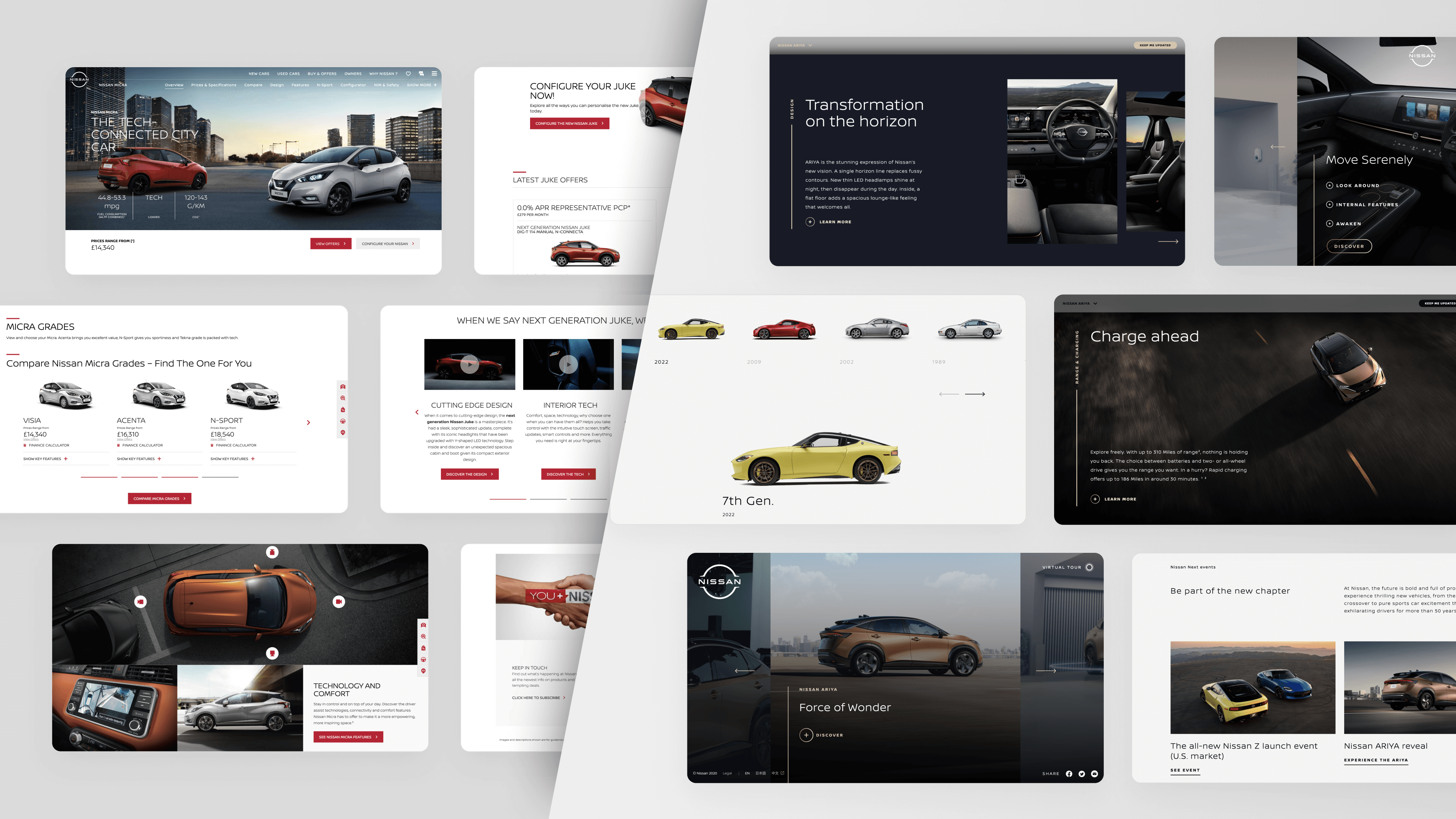
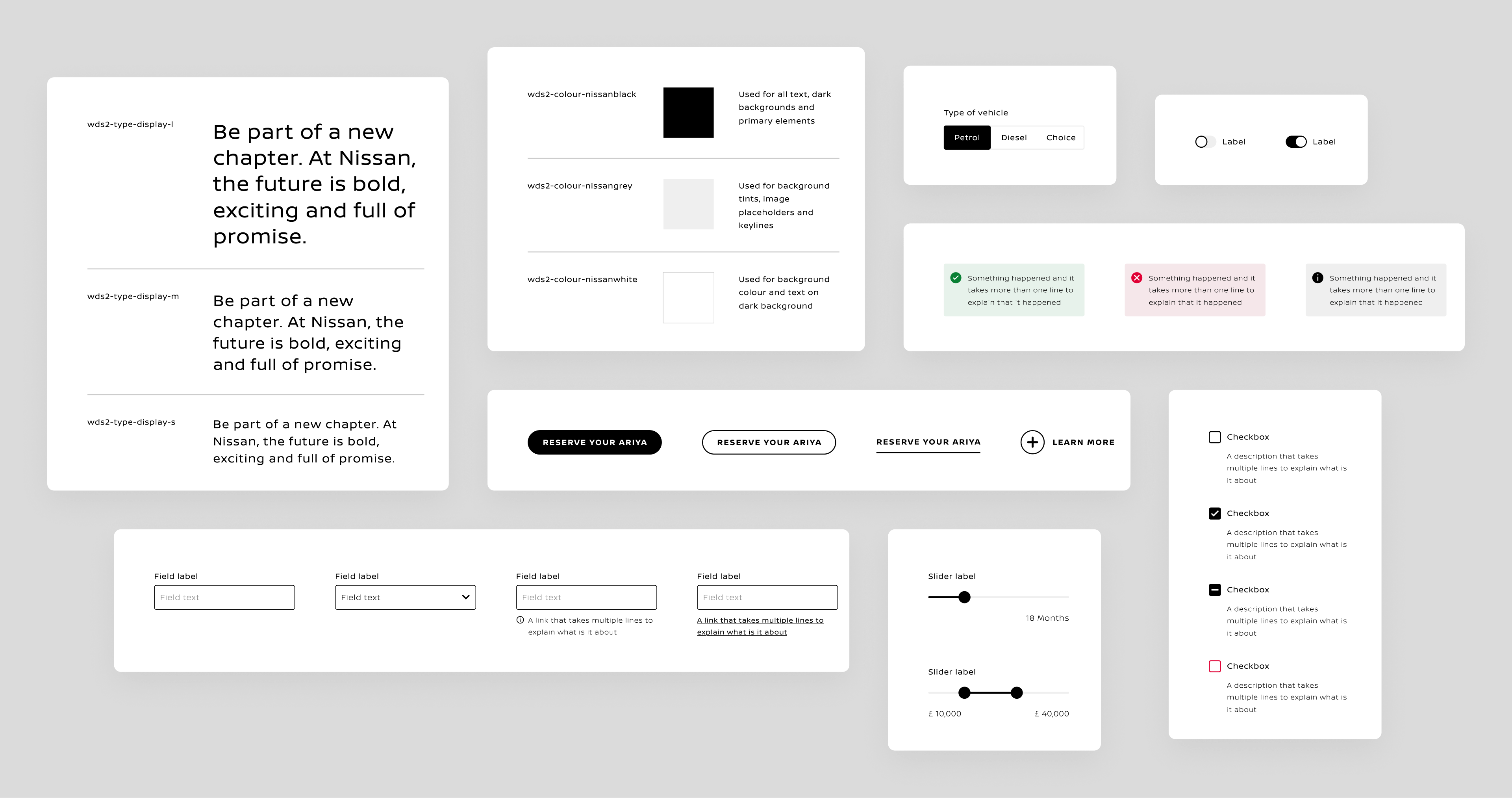
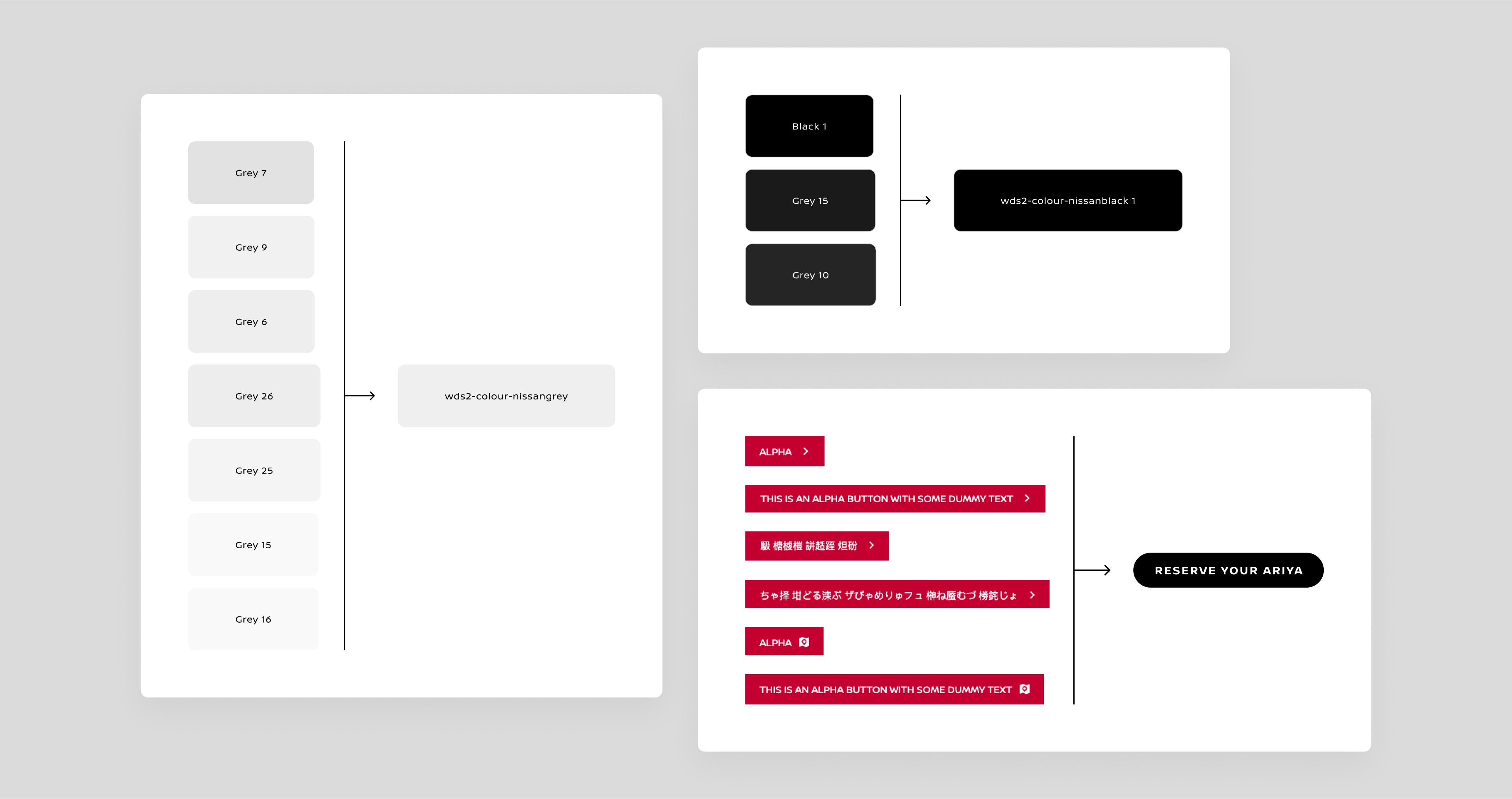
A thorough audit was conducted to identify similar texts, colours, UI elements, and patterns that could be consolidated.
For the components, an atomic design approach was utilised, constructing them from atoms to molecules to organisms.
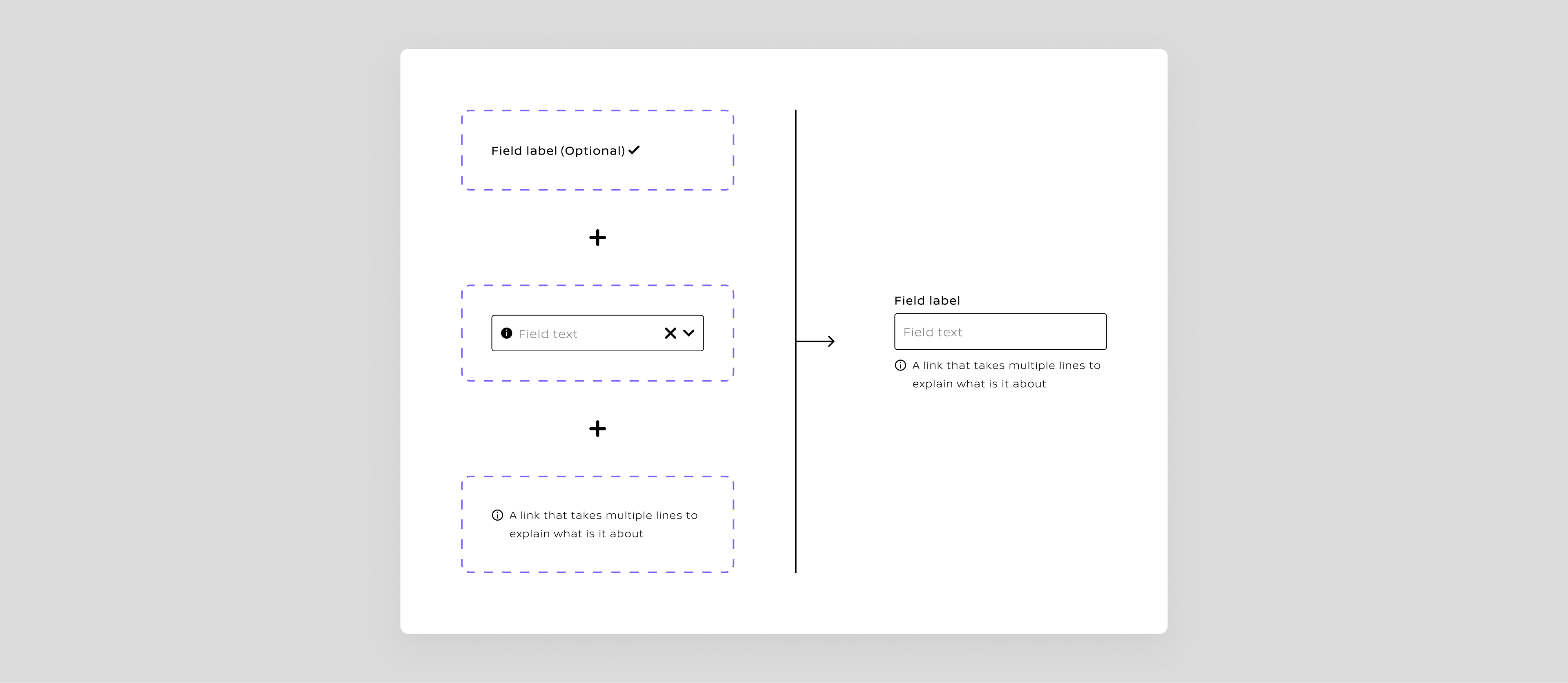
After constructing the master component as a base, instances were created for all types and states of the component. By leveraging Figma’s powerful variants feature, all types and states were combined into a single component. This approach significantly declutters the assets panel, simplifying the search for components.
Designers can pull the single visible instance of the input component from the library and change the variants to reflect the required states within a design.
For expandable components like a table, a single cell was deconstructed, incorporating all possible variants within it. Designers can start from a single cell to construct a table with the necessary columns and rows and modify the cell variants to create the desired table layout.
Some components are complicated to override without detaching the instance, which undermines the purpose of a design system. Therefore, non-destructive overrides were implemented, allowing modifications without detaching.
For the image placeholder component, all defined aspect ratios were combined into the variants.
However, Figma presents a challenge as it does not lock the image ratio when scaling the component. Research was conducted to implement a workaround to address this issue.
As the design evolved from atoms to molecules to organisms, complex components required a thorough audit of similar patterns across the existing site. One example is the product card component.
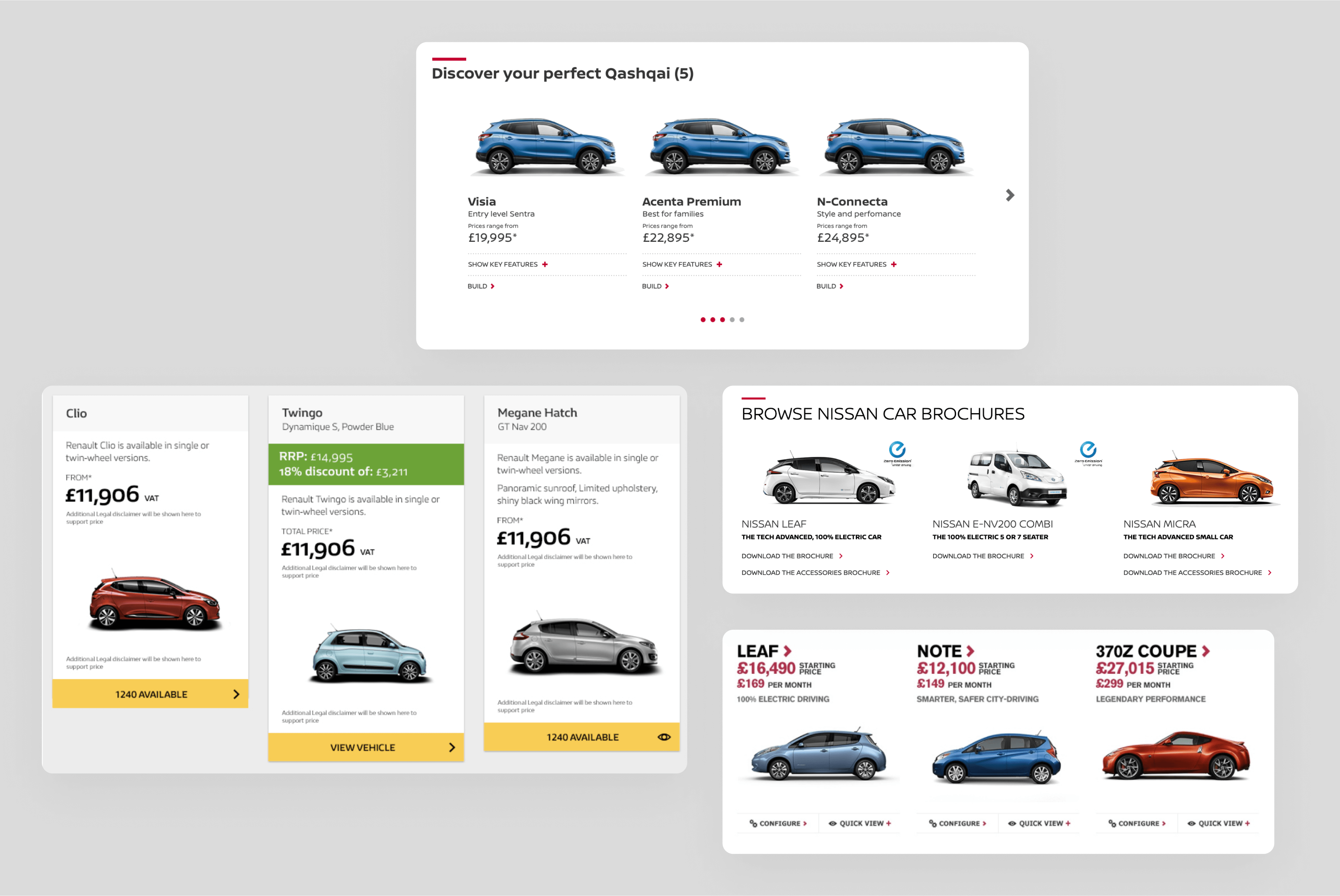
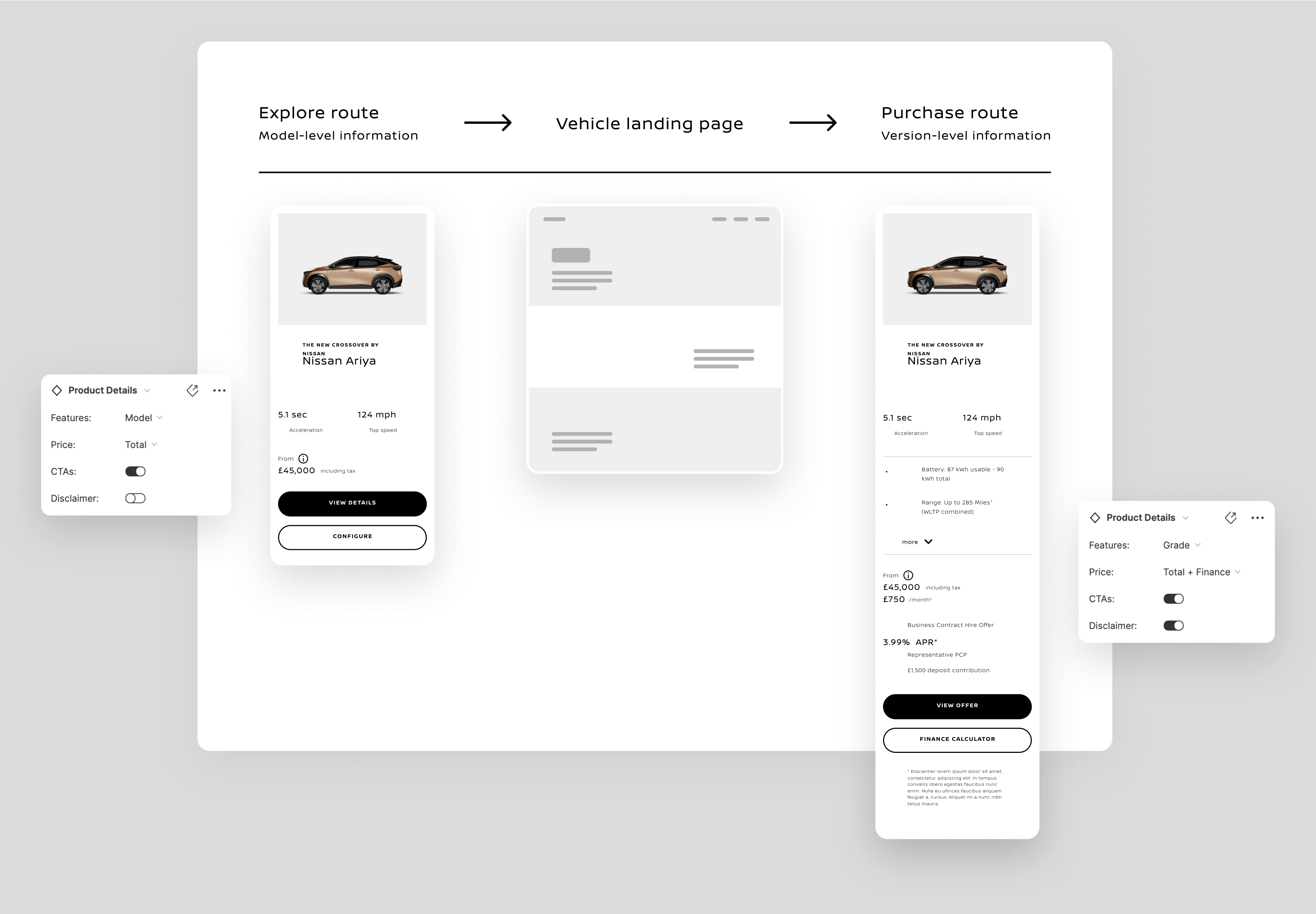
All the information a product card could contain was compiled to create a master component. Alternate pieces of information can be turned on or off based on the customer journey to create multiple variants.
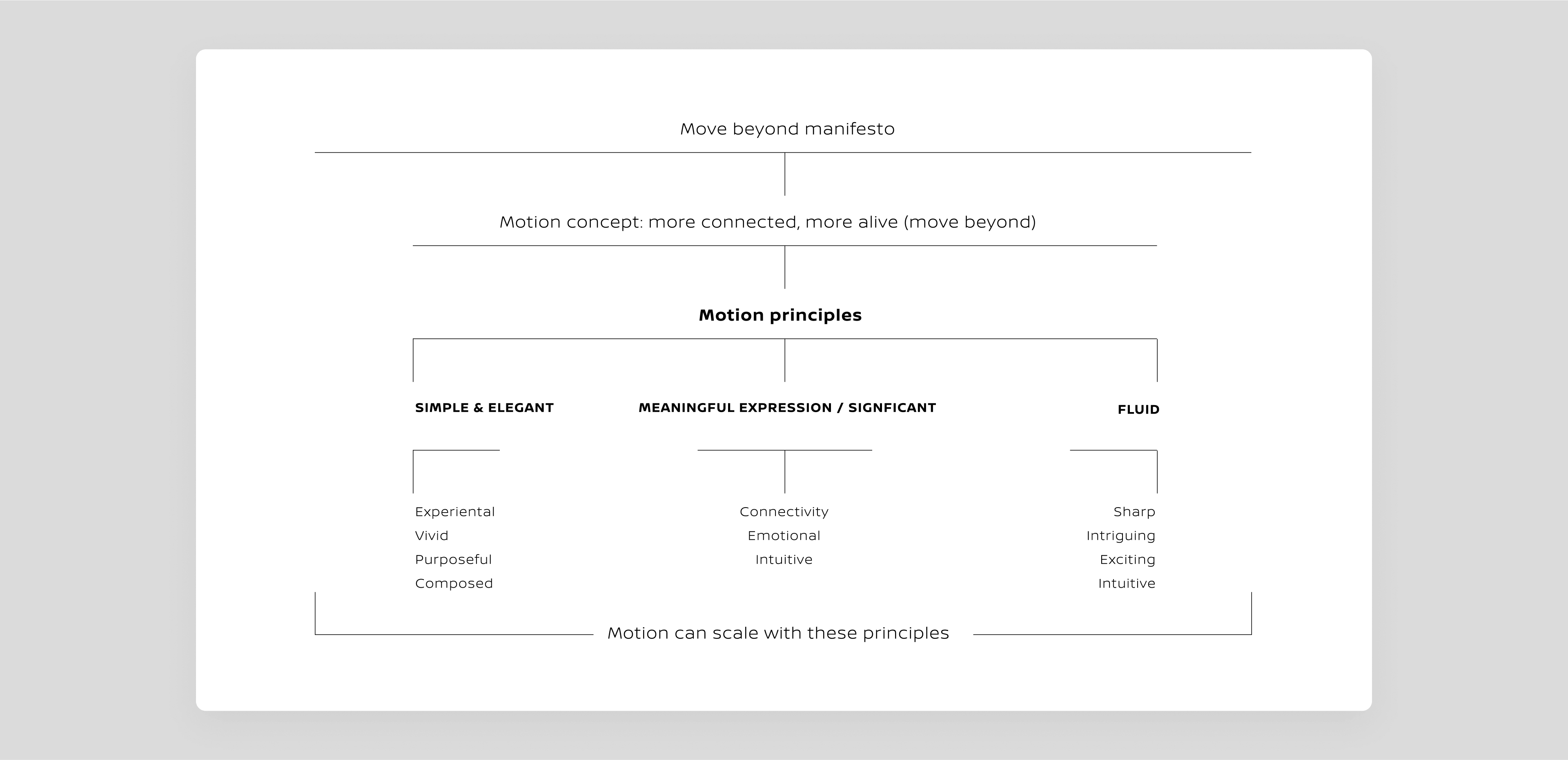
Adding motion into the Design System
As part of the design system, a branded motion principle was defined to be applied where needed.
A common language between the Design and the Tech
A shared language between design and tech was established by creating a custom repository that automatically pulls design tokens from Figma into code. This approach ensured seamless collaboration, with semantic naming providing consistency and ease of updates across both teams.
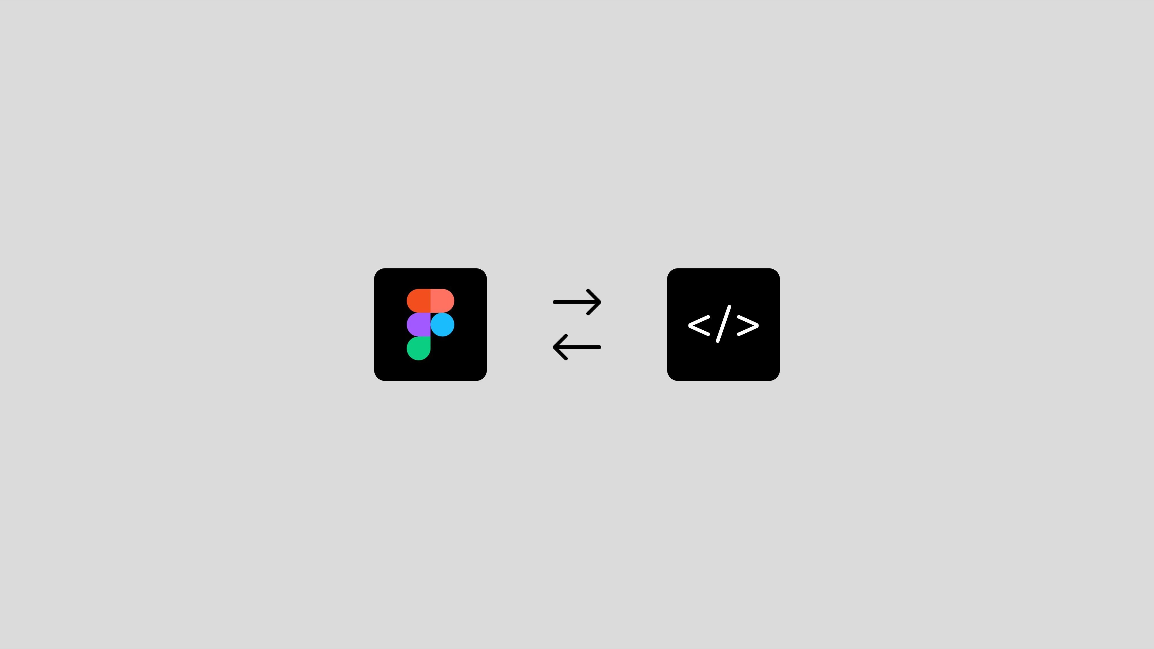
Collaboration with developers was essential in creating a design system that bridges the gap between design and code. A custom repository was developed to pull design tokens directly from the Figma file, eliminating manual updates. All design decisions were encapsulated within a base variable, and assigned semantic names for clarity at the component level. This approach simplifies the management and future updates of tokens.
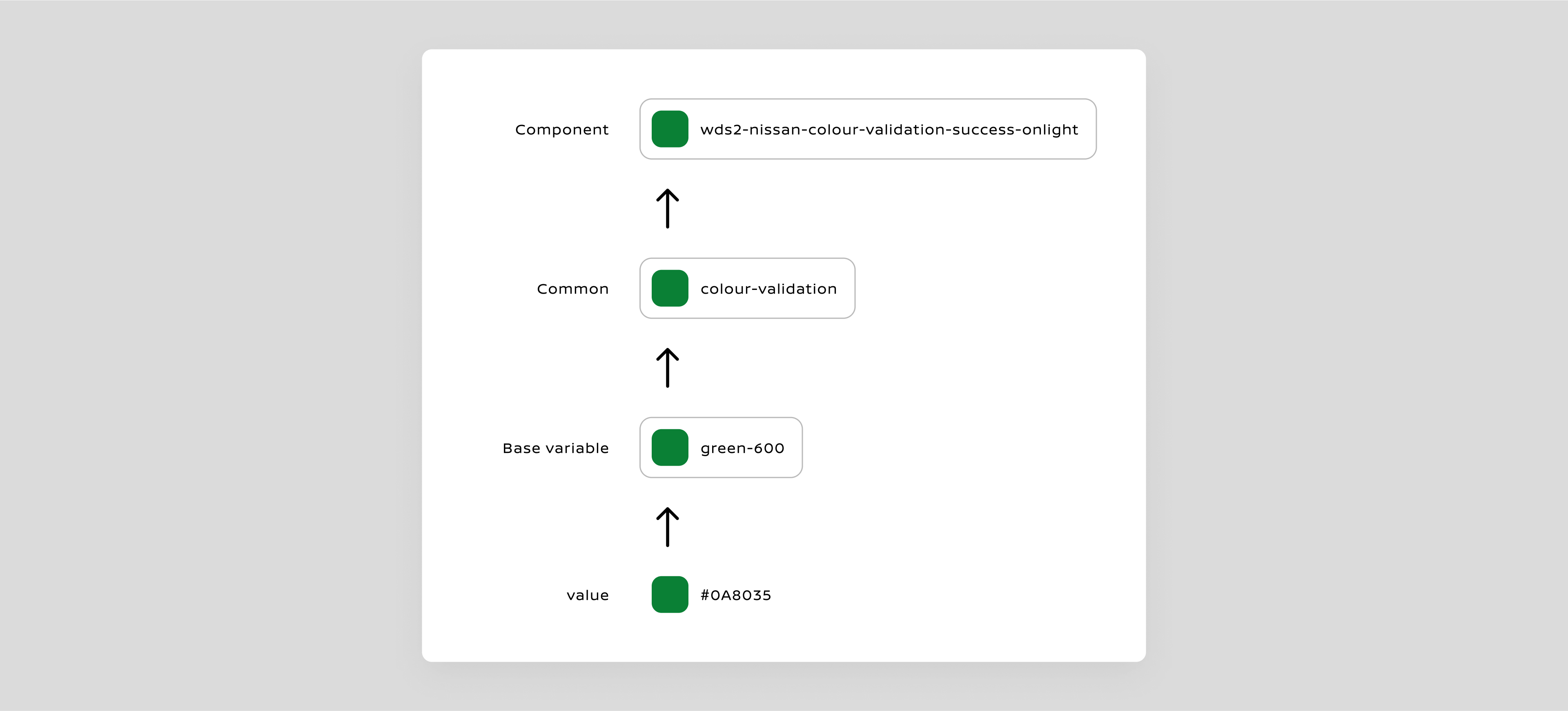
As the library expanded, naming component-level tokens presented challenges. This highlighted the need for a logical naming framework to facilitate the naming of new tokens and components in the future.
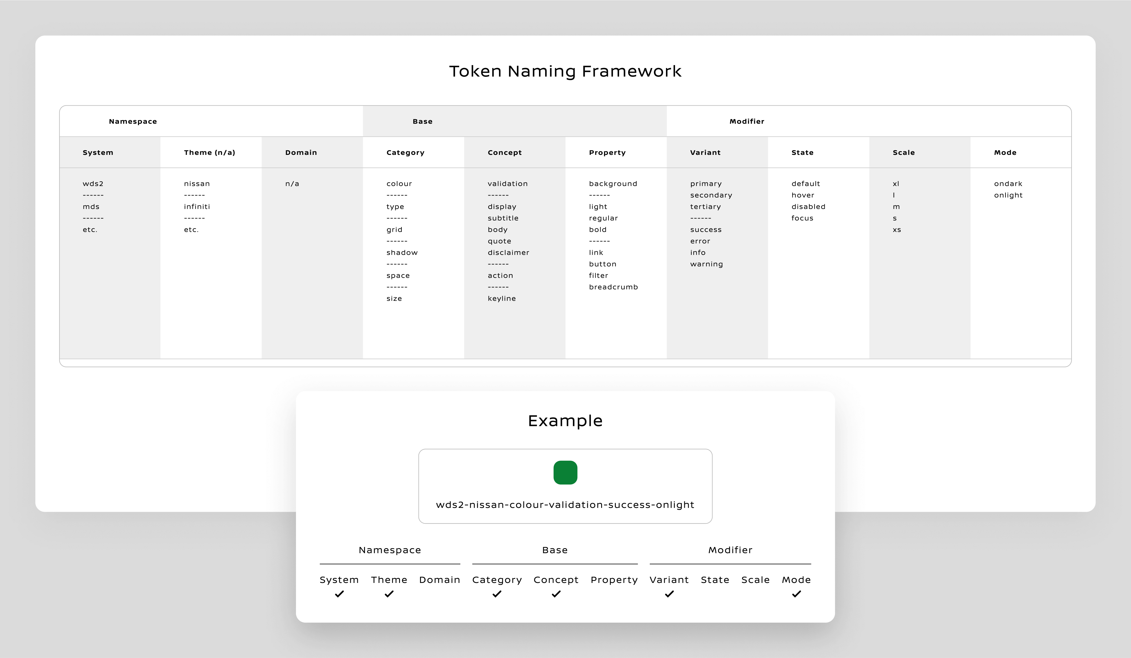
This code-friendly naming framework allows developers to easily fetch tokens directly from Figma without altering names in the coding environment. In conclusion, a solid foundation of a design system was established, effectively bridging the disconnect between design and code.